In this short project, we’ll create a series of postcards from Corita Kent’s 10 Rules for Students, Teachers, and Life. When we’re done, we should have a full set of postcards that we can print and share.
Category: Project (page 3 of 4)
You’re welcome to use images in your books and it can make it a more exciting project to do (and probably to read). We do need to follow some guidelines when doing that (which are really just good practices for being a designer). Those guidelines are:
1.
Use images you’re allowed to use. This means Public Domain (where the copyright has expired, or where the makers of the images have explicitly made them public domain) images or Creative Commons images (where the makers have explicitly said the images are ok to use) or original images.
Maybe you’re already experts in this because of Forum last week.
Sources for ok-to-use images:
Archive.org may have scans of the book you’re doing. Which means you could use the actual images that your book is referring to. You’ll need to find your book on there, download it, and crop/take screenshots of the images.
https://archive.org/details/texts
Google has an advanced search feature that will help you find images you’re legally allowed to use. More on that here:
https://support.google.com/websearch/answer/29508?hl=en
There are other sources, and you can certainly try to find other sources of free-to-use images. Just make sure they’re things you are allowed to use.
2.
Make sure your images are correct. If the book is referring to a certain image/person/flower/bird/event, make sure your image is of that actual image/person/flower/bird/event! These should mean something specific and not just be decoration.
3.
Be consistent with your images. If the style of one image is a line drawing, it’s likely that all your images should be line drawings. If you’re choosing to include/find new images, your choice of those is part of the design of your book. So be deliberate about that.
Indesign’s way of dealing with images can be weird at first. Once you do it a bit, it (sort of) makes more sense.
Also, your images don’t live inside Indesign. So, you need to make a new folder with your images that you save to Google Drive or wherever you save your Indesign file. You need to make a new folder with your images and save it to Google Drive. (just saying it twice because it’s important)
There’s a tutorial video here that should help you.
https://helpx.adobe.com/indesign/atv/cs6-tutorial/working-with-graphics.html
and there’s a whole tutorial article that will help. My preferred way of getting images into Indesign is to drag and drop from the Finder. Which is explained here: https://helpx.adobe.com/indesign/using/placing-graphics.html#drag_and_drop_graphics
and that whole article (scroll up or down) can also be helpful.
You may/probably want to control how your images and text interact. In Indesign, this is often done through Text Wrap.
Instructions on Text Wrap at: https://helpx.adobe.com/indesign/using/text-wrap.html
4.
Give your images room. A lot of times, people want to really try to save space when putting in images. Don’t worry about that. Give them the room they need. That means make them large if they need to be. And create space between your text and images.
The site practicaltypography.com can be a great reference for a lot of the practical things we talk about in class. We’ve talked about all these topics, but refer back to these if you forget:
last but not least, Hyphens and Dashes
What goes where in a book? This helps explain that.
A colophon is a short piece of text (sometimes including a printer’s mark) usually at the end of a book that details which typefaces were used, printing techniques, papers used, binding methods, etc. The book’s designer’s name often goes in the colophon. In general, it gives information on the design and production of a book.
You can use it to note your design details and credit yourself in your book. Look for them in other books!
Design a book that:
• Invites and guides readers • Avoids hindering reading
• Is aesthetically appealing • Reveals the structure of the text and design.
As you begin, make sure these basic choices are working together to make your text readable: Typeface, font size, page size, margins, leading, line length, letterspacing.
We did that largely during our comps phase, but we may revisit some of these if we find that they’re not working.
As we make the first proofs of your book, we will:
- Get your book’s text into Indesign.
- Clean up the text as needed.
- Begin to apply your design decisions to that text.
- Refine your book’s typography by tending to a series of fine typographic details.
Create comps for 3 of your sketches/mockups.
For Each Comp
- Recreate one of your sketches/mockups in Indesign
- Use the page size you specified
- Use the margins you specified
- Place your headers, folios, etc. where you specified

We’re going to talk about margins while making books. A lot.
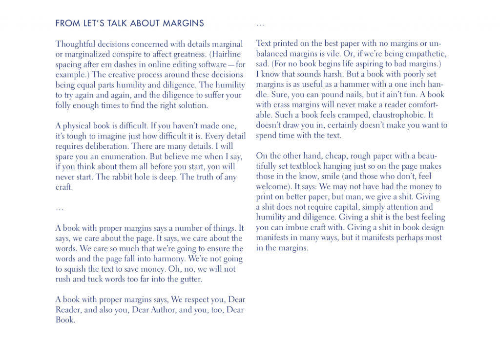
And you may want to re-read Let’s Talk About Margins
In this project, we’re designing and producing books! We’ll design the interior and the cover. We’re get more Indesign skills and experience, maybe more Illustrator, more big picture type, more detailed type, more making skills, more everything! But also less, because less is also important.
We’re going to start designing the book as a container for the text. What you’re designing with your book (at first) is the system for holding that text. And that system should resonate with the content of your book.
Download Book, Pt. 1 Handout—Now with correct schedule!
Read more →