Page 5 of 8

Find and format text between underscores

To find text between underscores (which means it should be italicized), do these steps.

  1. Go to Find/Change (command f)
  2. Click on the GREP tab from the tabs at the top
  3. Copy & Paste in this expression :
(?<=_).*?(?=_)

This will find text between underscores. If you create a character style for your italics, you can use Indesign’s Change Format option to apply that style to the text you find.

Book Reading

Read, in Thinking with Type:

Type Families – Punctuation (48–57)

Font Formats – Font Families (80–82)

Alignment – Hierarchy (112–132, skipping the exercise in the middle).

Week 7 Day 2

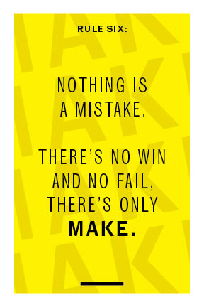
For this short project, we’re making 12 postcards (4 variations each on 3 different rules from Corita Kent).

We’re then uploading and getting feedback on those, narrowing those down.

Then, we’re refining them to make 2 variations each.

Example Postcard:

Corita Kent, Rules

In this short project, we’ll create a series of postcards from Corita Kent’s 10 Rules for Students, Teachers, and Life. When we’re done, we should have a full set of postcards that we can print and share. 

Download Corita Kent Rules handout

Upload your first round of postcards here.

Turn in/Upload for Corita postcards

How to comment in Google Drive

Go to this link, then jump down to the section for “Comment on PDFs”

Week 7 Day 1

Today in class, we have a couple things you can do remotely:

1. Books

Today, export a PDF of your book progress. I’m excited to see how far you’ve all gotten and if you’ve made progress with your images.

If you haven’t gotten to 15–20 pages, or if you don’t know where you’re ending it, do that today. Then make your PDF.

Here’s what to do:
If you don’t know how to export a PDF already, there are instructions here: https://helpx.adobe.com/indesign/how-to/indesign-create-pdf-for-print.html

Use these settings:
• Preset: High quality print (the top dialog in the Export window)
• Range: this is which pages you’re exporting. Export just the pages you’ve finished. So, in this box, you might have 1-20 or something similar. If it gives you grief, just export the whole thing (it’s better if you don’t, but it’s fine)
• Check the box for Spreads, so you’re exporting as spreads.

Upload this to the shared folder in Google Drive. Click here to upload

2. Preparation

Then watch these videos as preparation + inspiration for our letterpress workshop (they’re also just good things/people to know about).

The videos are here.

Letterpress Inspiration + Preparation

Erik Spiekermann

Erik Spiekermann is one of the big type designers of the 20th century. He’s a designer, a type designer, and printer.

He has a substantial German accent (which is totally understandable, but maybe it takes a second sometimes). So, turn on captions if you need to!

He says a lot of things in about 6 minutes, so do pay attention.

Specifically, listen pay attention to what he says about:
• Constraints
• Touching space
• Modularity
(but also everything else)

Colby Poster Printing

Colby Poster Printing was a poster printer in Los Angeles that closed a few years ago. They printed posters for local events and other advertisements that would go up on phone poles and the like. But they had a really distinct aesthetic—not fancy design but somehow really amazing. You’re probably seen posters like their yellow or three-color posters often.

also, check out more of Colby Poster Printing’s posters here:

Both of those videos show/talk about using wood type.

Letterpress type comes in two big varieties: metal/lead and wood. Wood type is usually larger than metal type, because, since wood is lighter than metal, people can make larger type without it becoming too heavy to use.

We don’t have much wood type at Loyola, so in our workshop we’ll be using metal type, which really just means we’ll work at a smaller scale in this workshop. We’ll concentrate on getting some basics in letterpress and make fun things with it, so that later we can use it in other projects or go further.

As you watch, see if you get inspiration in the way they combine type or just use type/words in a really matter-of-fact way.

Corita Kent

Corita Kent was a designer/artist (she probably would’ve just said an artist) and nun. Her most famous work comes from the 1960s and combines pop art interests with a very human side. Her work and the way she made work about values are a great reference point for us as designers at a Jesuit school. Whether or not we believe in Jesuit values in a religious sense, ideally the school’s broader values – which are often just ways of being human – pervade what we do and make here at Loyola. And Corita Kent makes a great example of doing that.

We’ll be using her rules in our letterpress workshop.

Make note the three rules you got the most from.

Week 6 Day 2

Here’s the progress you should make:

Read the readings from Thinking with Type I put online Tuesday.

Some of this information is directly related to what we’re doing. If something gives you a new idea or leads you to a slightly rethink what you’re doing in part of your book (which it might!) start applying that new thinking to your book.

Figure out your book length (approximately).
Figure out where you want to cut your text off. You need to cut off at a reasonable point like between chapters, between sections, etc.

You should have at least 8,000 words. You’re welcome to go over 15,000. But you probably don’t want to bind a book that goes over 50 pages. There’s a lot of room between 8,000 words and 50 pages for you to decide where you want to cut off the text.

To count words in Indesign:
http://www.indesignskills.com/skills/word-count-indesign-document

Once you find the place you want to cut off the text, you don’t need to try to delete other text for now. Instead, for now, just insert a frame break (https://helpx.adobe.com/indesign/using/editing-text.html#add_column_frame_and_page_breaks)

We’ll talk about finalizing that break later.

If you’re using images, work on those.
I’ve talked to some of you about images, and told most of you something like “these can wait.” Well, I’m changing that a bit. So, if you’re including images or thinking about them, you can start putting those in.

Follow guidelines (and tips!) for finding/using images from Images for Your Book

Images for your book

You’re welcome to use images in your books and it can make it a more exciting project to do (and probably to read). We do need to follow some guidelines when doing that (which are really just good practices for being a designer). Those guidelines are:

1.

Use images you’re allowed to use. This means Public Domain (where the copyright has expired, or where the makers of the images have explicitly made them public domain) images or Creative Commons images (where the makers have explicitly said the images are ok to use) or original images.

Maybe you’re already experts in this because of Forum last week.

Sources for ok-to-use images:
Archive.org may have scans of the book you’re doing. Which means you could use the actual images that your book is referring to. You’ll need to find your book on there, download it, and crop/take screenshots of the images.
https://archive.org/details/texts

Google has an advanced search feature that will help you find images you’re legally allowed to use. More on that here:
https://support.google.com/websearch/answer/29508?hl=en

There are other sources, and you can certainly try to find other sources of free-to-use images. Just make sure they’re things you are allowed to use.

2.

Make sure your images are correct. If the book is referring to a certain image/person/flower/bird/event, make sure your image is of that actual image/person/flower/bird/event! These should mean something specific and not just be decoration.

3.

Be consistent with your images. If the style of one image is a line drawing, it’s likely that all your images should be line drawings. If you’re choosing to include/find new images, your choice of those is part of the design of your book. So be deliberate about that.

Indesign’s way of dealing with images can be weird at first. Once you do it a bit, it (sort of) makes more sense.

Also, your images don’t live inside Indesign. So, you need to make a new folder with your images that you save to Google Drive or wherever you save your Indesign file. You need to make a new folder with your images and save it to Google Drive. (just saying it twice because it’s important)

There’s a tutorial video here that should help you.
https://helpx.adobe.com/indesign/atv/cs6-tutorial/working-with-graphics.html

and there’s a whole tutorial article that will help. My preferred way of getting images into Indesign is to drag and drop from the Finder. Which is explained here: https://helpx.adobe.com/indesign/using/placing-graphics.html#drag_and_drop_graphics

and that whole article (scroll up or down) can also be helpful.

You may/probably want to control how your images and text interact. In Indesign, this is often done through Text Wrap.

Instructions on Text Wrap at: https://helpx.adobe.com/indesign/using/text-wrap.html

4.

Give your images room. A lot of times, people want to really try to save space when putting in images. Don’t worry about that. Give them the room they need. That means make them large if they need to be. And create space between your text and images.