Page 6 of 8

Week 6 Day 1

Today in class, we are:

Looking at the 15 pages you’ve done in your books so far

Reviewing and talking about new Indesign/type knowledge

Talking about book anatomy

Working!

For next time:

See how much of your book you can get in, roughly if necessary.

Decide where you’ll cut off your text.

Read about Type Families, Numbers, Font Formats, Alignment, and more!

Practical Typography

The site practicaltypography.com can be a great reference for a lot of the practical things we talk about in class. We’ve talked about all these topics, but refer back to these if you forget:

Carriage Returns

Hard Line Breaks

Widow & Orphan Control

Common Accented Characters

Centered Text

last but not least, Hyphens and Dashes

Book Anatomy

What goes where in a book? This helps explain that.

View Book Anatomy Diagram

A colophon is a short piece of text (sometimes including a printer’s mark) usually at the end of a book that details which typefaces were used, printing techniques, papers used, binding methods, etc. The book’s designer’s name often goes in the colophon. In general, it gives information on the design and production of a book.

You can use it to note your design details and credit yourself in your book. Look for them in other books!

Week 5 Day 2

Today in class, we are:

Looking at book comps

Talking about making proofs

Talking about these Indesign skills:

  • Master Pages
  • Paragraph and Character Styles
  • Space Before / Space After
  • First Line Indent
  • Accented characters
  • Glyphs Palette and other OpenType features
  • more skills

Working

For next time: (updated!)

Create a 15 page proof of your book

  • Format the first 15 pages, starting at the first chapter (or the first chapter you’re doing)
  • Don’t worry about title page, table of contents, etc. for now
  • If you get to a part where you don’t remember what we did or are unsure, you can skip that part for now and go on with the rest of the tasks/pages

Read more →

Book: Text + Proofs

Design a book that:
• Invites and guides readers • Avoids hindering reading
• Is aesthetically appealing • Reveals the structure of the text and design.

As you begin, make sure these basic choices are working together to make your text readable: Typeface, font size, page size, margins, leading, line length, letterspacing.

We did that largely during our comps phase, but we may revisit some of these if we find that they’re not working. 

As we make the first proofs of your book, we will:

  1. Get your book’s text into Indesign.
  2. Clean up the text as needed.
  3. Begin to apply your design decisions to that text.
  4. Refine your book’s typography by tending to a series of fine typographic details.

Download Text + Proof Handout

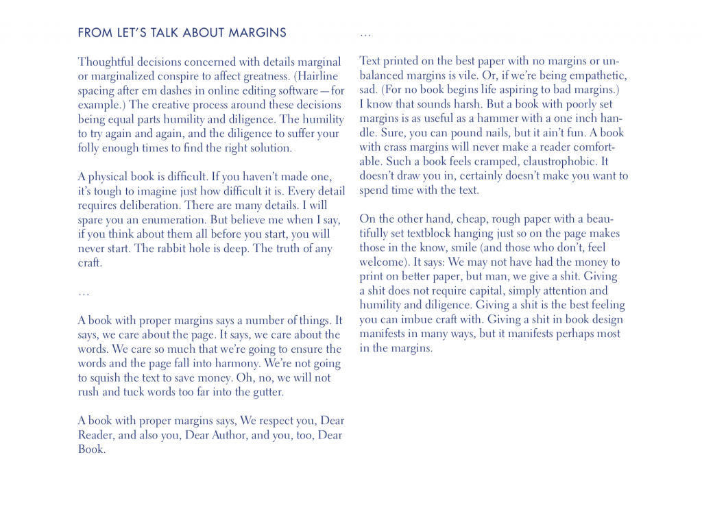
Typewriter Habits from Butterick’s Practical Typography
Week 5 Day 1

Today in class, we are:

Looking at your mockups

Talking about low-resolution mockups

Talking about comps for the Book project

Talking Indesign

Working on book comps

For next time:

Finish your 3 sets of book comps

Book, comps

Create comps for 3 of your sketches/mockups.

For Each Comp

  • Recreate one of your sketches/mockups in Indesign
  • Use the page size you specified
  • Use the margins you specified
  • Place your headers, folios, etc. where you specified

Download Book: Comps handout

Week 4 Day 2

Today in class, we are:

Looking at your Type Specimens

Talking about making books

Examining books and making mockups of books

For next time:

Make 8 paper mockups for your books. These mockups should be full sized paper versions of a spread for your book. They should have margins drawn/specified, page numbers, running headers, and anything else your page will need.

Mockup examples here.

Margins (again)

We’re going to talk about margins while making books. A lot.

And you may want to re-read Let’s Talk About Margins

Book, Pt. 1

In this project, we’re designing and producing books! We’ll design the interior and the cover. We’re get more Indesign skills and experience, maybe more Illustrator, more big picture type, more detailed type, more making skills, more everything! But also less, because less is also important. 

We’re going to start designing the book as a container for the text. What you’re ­designing with your book (at first) is the system for holding that text. And that ­system should resonate with the content of your book. 

Download Book, Pt. 1 Handout—Now with correct schedule!

Read more →