Type 2, 9:30 AM:
Book: 7×7 (spread is 14×7)
Colors: blue & sea foam
Download 14×7 Illustrator file with spot colors
Type 2, 2:00 PM:
Book: 7×10 (spread is 17×10)
Colors: pink & blue
Book: 7×7 (spread is 14×7)
Colors: blue & sea foam
Download 14×7 Illustrator file with spot colors
Book: 7×10 (spread is 17×10)
Colors: pink & blue
If you found something in the template books you want, these are the files that are on the CDs.
Looking at your artifact sketches/ideas
Looking at your type
Talking about type specimen books
Working!
Keep making any refinements you need to your type
Bring in prototypes/mockups for your artifacts
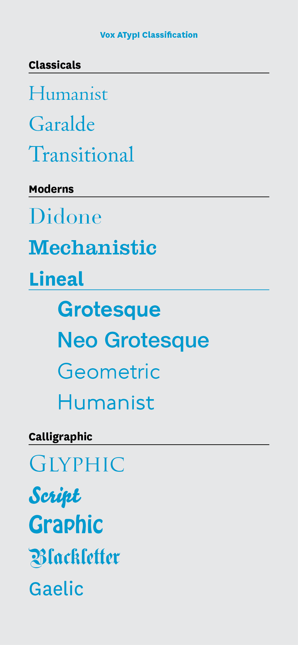
Doing an exercise on Type Classification
Looking at your type
Talking about the next phase of this project (Artifacts + Type Specimen)
Working!
Revise your typeface
Bring in ideas, sketches, brainstorms for artifacts
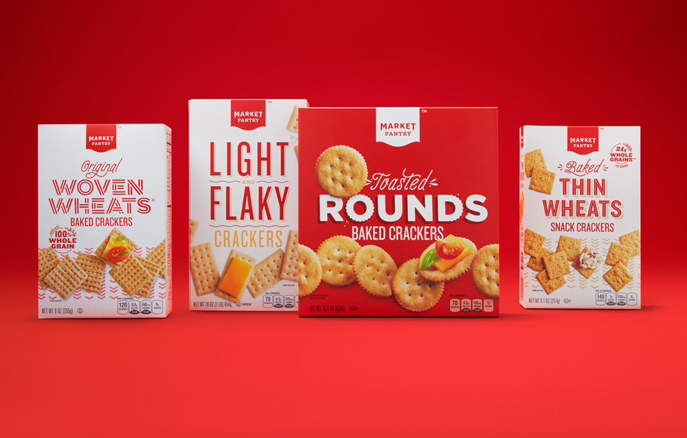
Seeing type in use is much more powerful than simply seeing the alphabet in various sizes. It shows off its best features, gives possible contexts, and shows potential uses. For our project, too, it helps create a way for it to live in the world.
Looking at your type!
Refining!
Making new type!
Make the rest of your alphabet + punctuation
In the Designing Typefaces chapter of Lettering and Type, read Behind a Face – Punctuation and Accents (97–118)
Looking at your current set of letters (you should have 10 at this point)
Working on new letters
Revise your current letters and make 10 new letters to make 20 letters total.
In Lettering & Type, read the chapter Systems & Typologies, pages 16–35.
As we continue to expand and refine the typefaces you’re creating, we’ll be going back and forth between expanding, testing, refining, expanding, and more testing.
At the end of this process, you should have:
1. a complete alphabet (upper or lowercase)
2. at least 4 punctuation symbols