Category: Hybrid Type (page 1 of 2)

Changing Units + Color Mode in Illustrator

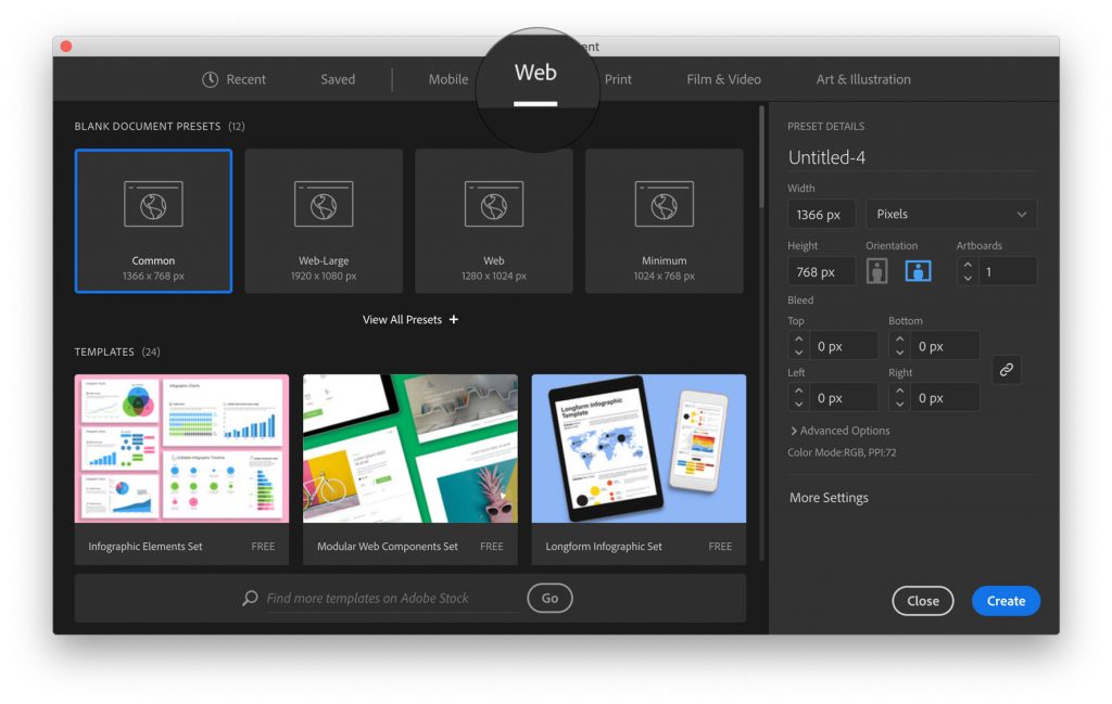
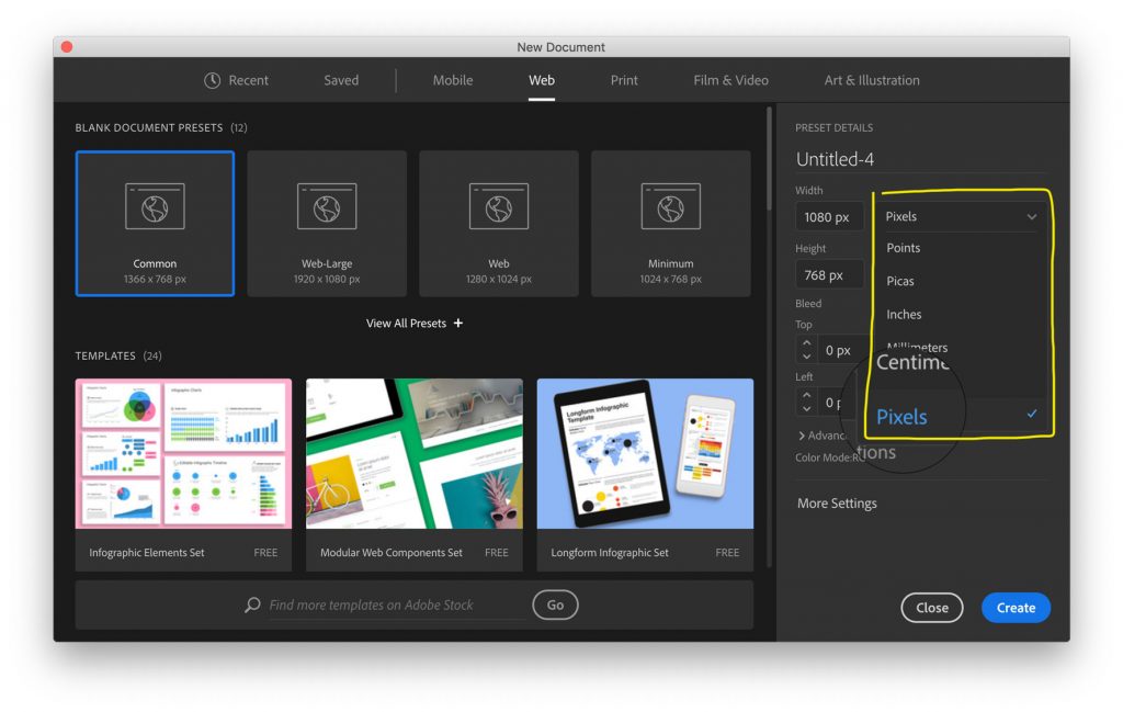
Since in this project, our final product is for screen, we should size it in units made for screens.

By choosing the Web tab in the Illustrator New Document dialog, it sets the units to pixels (px) and the color mode to RGB (red green blue) which will each give you more reliable output than other options.

Simply choosing the Web tab should do a lot. Then you can add your actual pixel dimensions. And you can, if you want, double check to make sure you’re using pixels (as opposed to another set of units).

Screenshots for illustration:

Type Specimen Turn-In

Turn in type specimens here (once you’re actually done)

Nutrition Label Generator

Want to avoid a blurry or pixelated nutrition label?

Use this handy nutrition label generator!

Boxes!

If anyone is still looking for / looking for a better box template, this site has custom templates based on the dimensions you need.

Template Maker

Book Guidelines

We’re printing our type specimen books on the Risograph printer, and they’ll come out great. But, the Riso has a number of quirks that we need to work with when designing. So, here are some general guides:

  • Don’t design in a way that the two colors need to line up perfectly. We can get registration – the lining up of the two different colors – pretty close, but it’s rarely exact. So, design in a way that can tolerate (or even benefit from?) that kind of imperfection.
  • Avoid huge areas of solid colors. Because the Riso prints with real ink that’s slow to dry, very large areas of color have trouble drying and often create messes which don’t end up looking great in the end.
  • We’re using two colors for this, but remember that you can use tints of those colors. If you use the files I uploaded for your class, there are spot colors set up in them, and you can use a tint of that spot color by adjusting the slider in the Color palette in Illustrator. Remember, this is different than the Opacity palette! It looks like this.

Book details

Type 2, 9:30 AM:

Book: 7×7 (spread is 14×7)

Colors: blue & sea foam

Download 14×7 Illustrator file with spot colors

Type 2, 2:00 PM:

Book: 7×10 (spread is 17×10)

Colors: pink & blue

Download 14×10 Illustrator file with spot colors

Package/Other Templates

If you found something in the template books you want, these are the files that are on the CDs.

View/download templates

Artifact Examples

Package design of Target’s Market Pantry line of in-house food products: (click the image for analysis + more examples)

More Artifact/Ephemera examples:

Hybrid Type: Artifacts + Specimen

Seeing type in use is much more powerful than simply seeing the alphabet in various sizes. It shows off its best features, gives possible contexts, and shows potential uses. For our project, too, it helps create a way for it to live in the world. 

Download handout for Artifacts + Specimen

Hybrid Type: Refine & Expand

As we continue to expand and refine the typefaces you’re creating, we’ll be going back and forth between expanding, testing, refining, expanding, and more testing. 

At the end of this process, you should have:

1. a complete alphabet (upper or lowercase)

2. at least 4 punctuation symbols

Download handout for Hybrid Type: Refine & Expand