We’re printing our type specimen books on the Risograph printer, and they’ll come out great. But, the Riso has a number of quirks that we need to work with when designing. So, here are some general guides:
- Don’t design in a way that the two colors need to line up perfectly. We can get registration – the lining up of the two different colors – pretty close, but it’s rarely exact. So, design in a way that can tolerate (or even benefit from?) that kind of imperfection.
- Avoid huge areas of solid colors. Because the Riso prints with real ink that’s slow to dry, very large areas of color have trouble drying and often create messes which don’t end up looking great in the end.
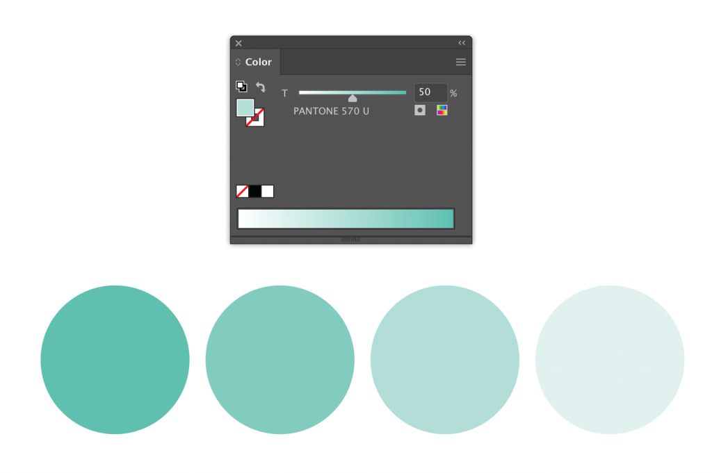
- We’re using two colors for this, but remember that you can use tints of those colors. If you use the files I uploaded for your class, there are spot colors set up in them, and you can use a tint of that spot color by adjusting the slider in the Color palette in Illustrator. Remember, this is different than the Opacity palette! It looks like this.
Comments are closed.