Today, we are:
Having an optional class!
Looking at finished instances
For next time:
Make sure you’ve turned in things, then take a break! Relax. Stay healthy. Then start thinking about all this some more when you have space in your brain.
Having an optional class!
Looking at finished instances
Make sure you’ve turned in things, then take a break! Relax. Stay healthy. Then start thinking about all this some more when you have space in your brain.
There’s no actual final exam for this class.
Revisions of your Type Instances will be due before the final exam time for the class.
We’ll have an optional meeting during our final exam time.
AM Class: 10am Thursday 5/7
PM Class: 2pm Thursday 5/7
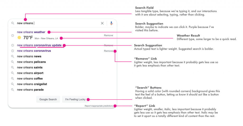
Looking at your redesigned Instances!
1. Comment on the Instances of each person in class (any that are uploaded) and choose at least one instance from each classmate to give one superlative (list of superlatives below)
2. Comment as needed/helpful on as many classmates’ work as you choose to give people feedback on their work: • what could be stronger • what’s strong as is • what’s interesting • what’s almost perfect • what’s illegible • what’s on an interesting line between form and function
3. Bring in ____ revised versions of your redesigned Instances
🛠 Most Useful
📖 Most Legible
👯♂️ Most Expressive
😎 Most Cool
☑️ Best Button
⌨️ Best Monospace
📟 Best Bitmap Type
Download San Francisco, Apple’s System Font
Information about Google’s use of Roboto
Download Robot at Google Fonts
Great information about and links to this genre of fonts on Font Review Journal (of course)
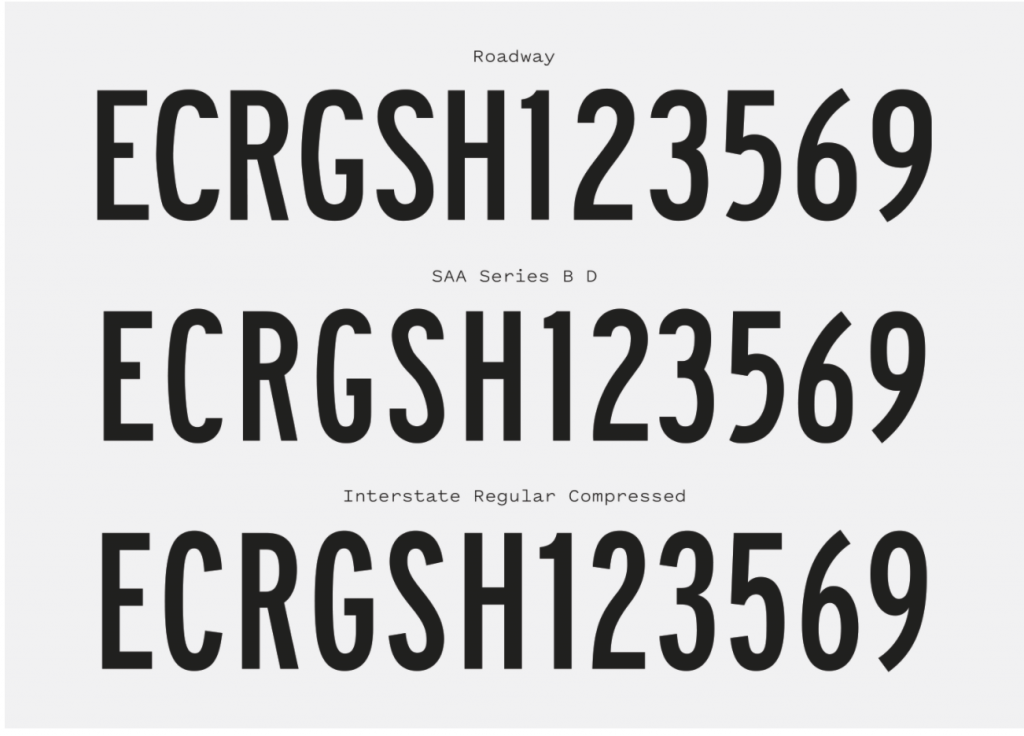
Download Roadway Font (free for personal use)
Someone started updating the Roadgeek fonts as an open source project in 2014, and you can download the 2014 Roadgeek fonts here
Read about the 2014 Updates (or contribute work to the project?)
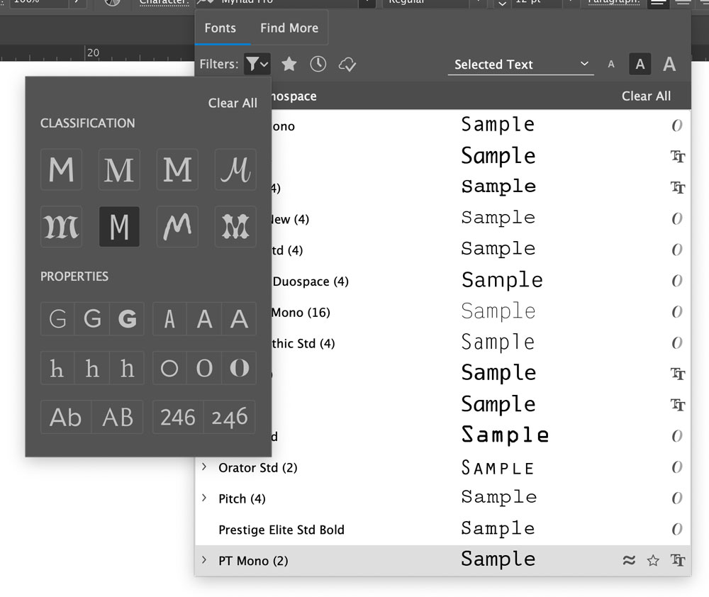
You most likely have a lot of monospaced type on your computer already. In Illustrator, you can filter your font menu to show them by clicking the Filter icon, then choosing the middle M on the bottom row (I know that’s not super clear). It looks like this:
IBM created a family of fonts called Plex that they use as the basis for a lot of their design. There’s a good monospaced version in it.
IBM has a lot of information about the design of Plex here.
Download Plex (including Plex Mono) here. (click the OpenType.zip or TrueType.zip at the bottom)
There’s another semi-monospaced font called iA Writer Duospace, from a company that makes a text editor called, wait for it, iA Writer. And the font isn’t monospaced, but duospaced, to where there are two widths of characters. If you want that sort of monospaced look, it’s a pretty good one. And a little more flexible than a purely monospaced font. Download iA Writer Duospace.
(the download for this one is annoying; you have to click the OTF link, then click each weight, the click the “Download” button, then go back, click the next weight… but it’s a good font. Plus free.)
Upload your instance diagrams/explanations in the appropriate folder:
Looking over diagrams and explanations
Talking about the next part of Instances project
Comment on 2-4 other people’s diagrams/explanations. Do you agree with them? Is there something you can add? Is there something good or that needs work about their recreation?
Create 5-10 redesigned versions (total) of your instances.
Create 5-10 (total) new versions of your instances.
The way you split up those 5-10 is up to you. The exact number you choose is up to you.
You could do 2 new versions of each of the 4 you brought in for Thursday. You could make 10 new versions of just one of them. You could do somewhere in the middle. It’s up to you.
Looking over the typographic instances you brought in
Talking about the next part of this project
Choose 4 of your instances, recreate them in Illustrator, then point out the pieces and explain the likely reasons for the choices
Look through other people’s typographic instances, and comment on 3-7.