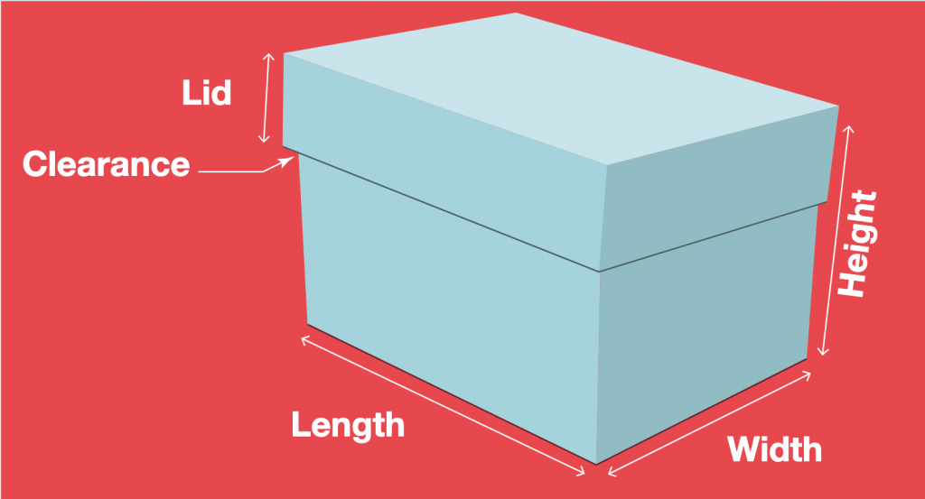
If anyone is still looking for / looking for a better box template, this site has custom templates based on the dimensions you need.
If anyone is still looking for / looking for a better box template, this site has custom templates based on the dimensions you need.
We’re printing our type specimen books on the Risograph printer, and they’ll come out great. But, the Riso has a number of quirks that we need to work with when designing. So, here are some general guides:
Book: 7×7 (spread is 14×7)
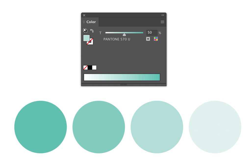
Colors: blue & sea foam
Download 14×7 Illustrator file with spot colors
Book: 7×10 (spread is 17×10)
Colors: pink & blue
If you found something in the template books you want, these are the files that are on the CDs.
Seeing type in use is much more powerful than simply seeing the alphabet in various sizes. It shows off its best features, gives possible contexts, and shows potential uses. For our project, too, it helps create a way for it to live in the world.
As we continue to expand and refine the typefaces you’re creating, we’ll be going back and forth between expanding, testing, refining, expanding, and more testing.
At the end of this process, you should have:
1. a complete alphabet (upper or lowercase)
2. at least 4 punctuation symbols
We’ll narrow and begin working with and exploring a variety of methods for combining type. We’ll then choose one method/pair to move forward.
Download Hybrid Type, Combining Handout
Re-download Type 1 fonts (password given in class)
In this project, we’re going to design a typeface by combining two disparate typefaces. We’ll then design a group type specimen book and a set of artifacts to further bring that typeface to life.
We’ll look really closely at type, scrutinize the anatomy and details of a typeface, and design a cohesive system for the letters of our alphabets.
We’ll get the first “parent” of our hybrid by tracing type from 19th and early 20th century type specimens.
Download Hybrid Type Pt. 1 Handout.
Download Type Specimens to use to choose type for Hybrid Type