Page 5 of 7

Font Review Journal

Read 3 reviews on Font Review Journal

Make a thread in the Font Review Journal Discussion Board on Blackboard of your favorite review you read

  • It can be because you like the font or you just like the review
  • Write one thing that you specifically liked about it (the review or the font itself)
  • Then, reply to one other person’s thread.
We should always be light in spirit. but not with our gestures.

Type Specimen Turn-In

Turn in type specimens here (once you’re actually done)

Week 9 Day 1

Today in class, we are:

Looking at finished artifacts!

Turning in finished artifacts.

Working on type specimens.

For next time:

Bring in a potentially final version of your type specimen.

Nutrition Label Generator

Want to avoid a blurry or pixelated nutrition label?

Use this handy nutrition label generator!

Week 8 Day 1

Today in class, we are:

Looking at mockups for second artifacts

Working

Looking individually at type specimens

For next class:

Bring in a second draft of each of your two artifacts

Make progress on type specimens

note:

Final artifacts are pushed to next Tuesday. Plan to have them done, polished, nice when you come in then!

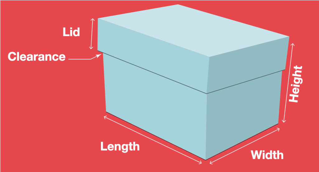
Boxes!

If anyone is still looking for / looking for a better box template, this site has custom templates based on the dimensions you need.

Template Maker

Post Break!

For Tuesday, 3/3, you should have:

A prototype/mockup for your second artifact

Remember, these can be rough, taped together, drafts. But they should be put-together versions of what you want to make. And they should, of course use your type (and other type as needed).

For Thursday, 3/5, you should work to have:

Two complete, final artifacts

Reminder:

Before the break, we had a mockup for our first artifacts and an initial draft of type specimen pages. So, you should have those if you didn’t already show them.

Week 7 Day 1

Today in class, we are:

Looking at your artifact mockups

Doing a demo/playtime on the Riso

Choosing a book size

Choosing a set of colors for your books

For Thursday:

Bring in a draft of your type specimen spread

Make progress on artifacts

Book Guidelines

We’re printing our type specimen books on the Risograph printer, and they’ll come out great. But, the Riso has a number of quirks that we need to work with when designing. So, here are some general guides:

  • Don’t design in a way that the two colors need to line up perfectly. We can get registration – the lining up of the two different colors – pretty close, but it’s rarely exact. So, design in a way that can tolerate (or even benefit from?) that kind of imperfection.
  • Avoid huge areas of solid colors. Because the Riso prints with real ink that’s slow to dry, very large areas of color have trouble drying and often create messes which don’t end up looking great in the end.
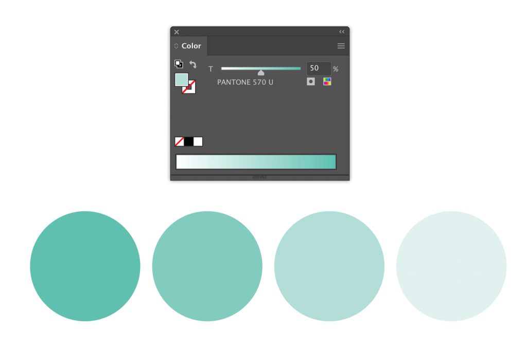
  • We’re using two colors for this, but remember that you can use tints of those colors. If you use the files I uploaded for your class, there are spot colors set up in them, and you can use a tint of that spot color by adjusting the slider in the Color palette in Illustrator. Remember, this is different than the Opacity palette! It looks like this.